
One product, five selling strategies.
Choose how the page talks to whoever lands on it. The block order, the tone of the copy and the visual weight change — the product data never does.
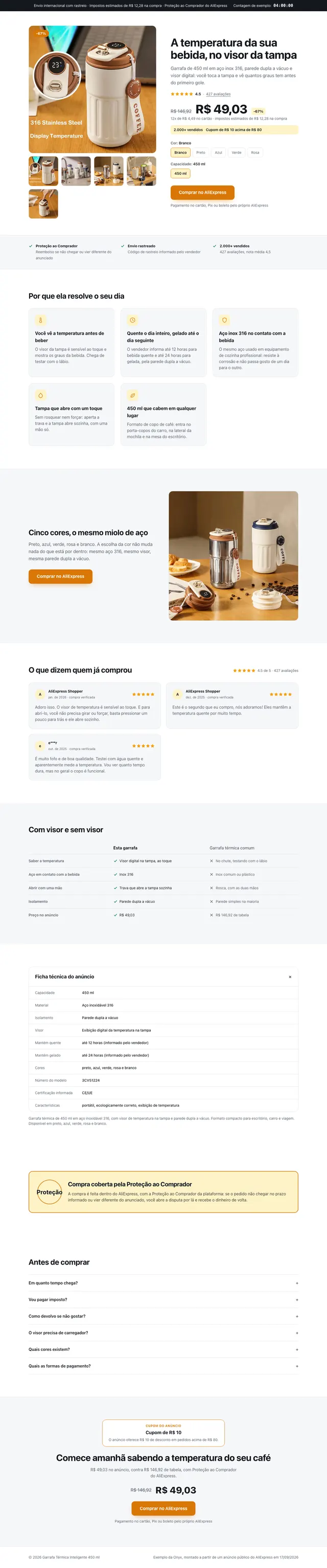
Direct Response
In every planCold traffic, Facebook and TikTok Ads
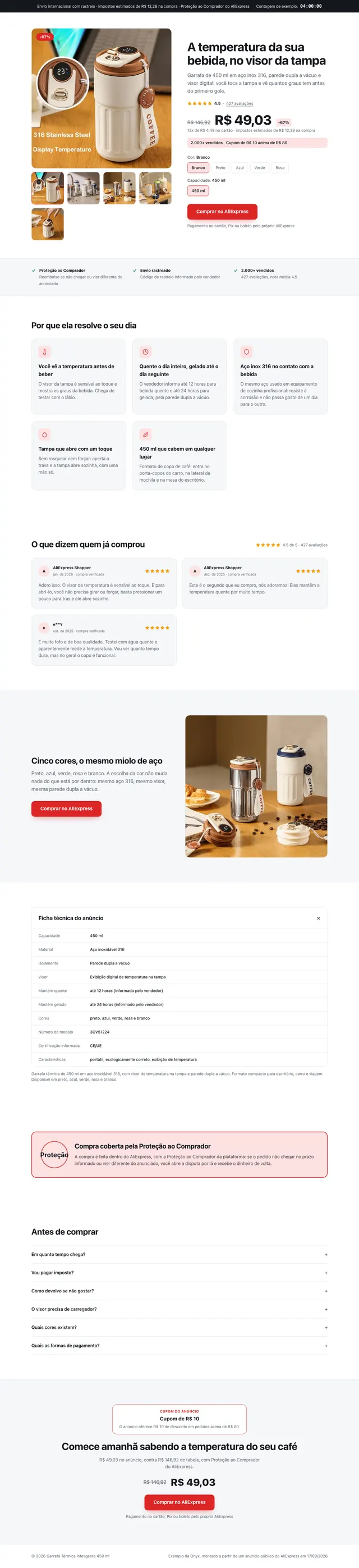
Long page, blunt copy, urgency at the top and a buy button repeated in every fold.
- Long page
- Aggressive copy
- Urgency at the top
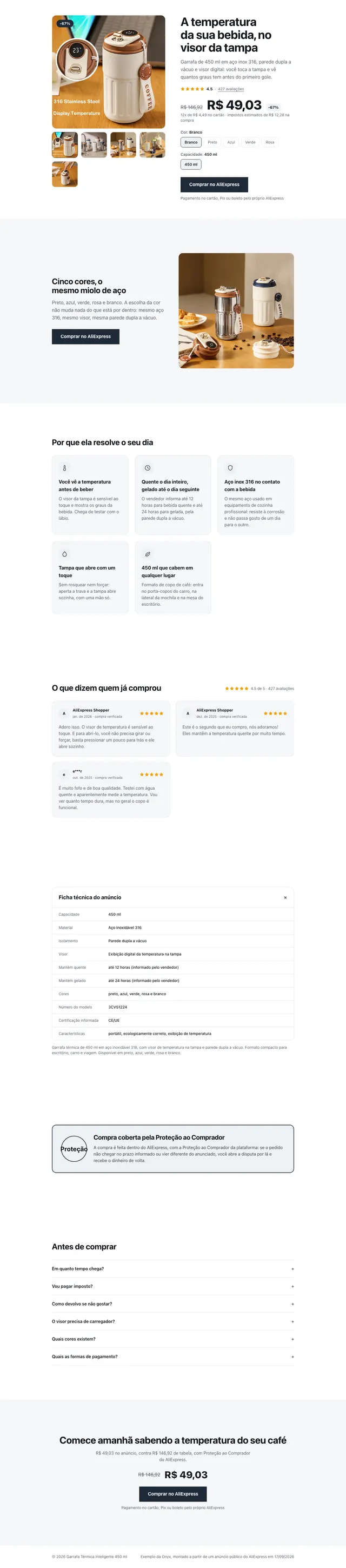
Minimal Premium
Pro and AgencyHigh ticket, brand-led products
Lots of white space, a large photo, little copy and a single buy button.
- Full-bleed photo
- Little text
- One CTA
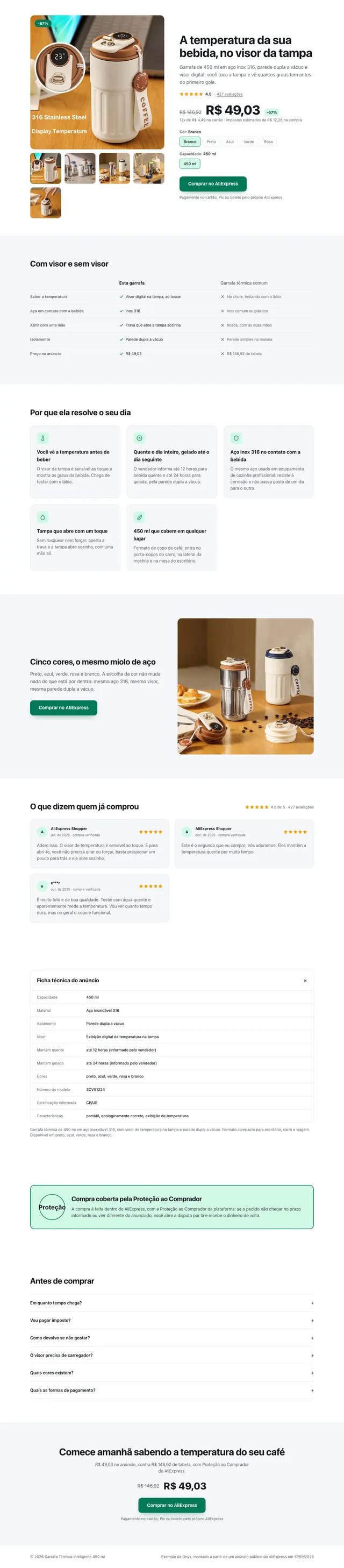
Comparison
Pro and AgencyProducts that fix one specific pain
A with-and-without table, a before and after, and objections answered early.
- With vs without table
- Before and after
- Objections answered early
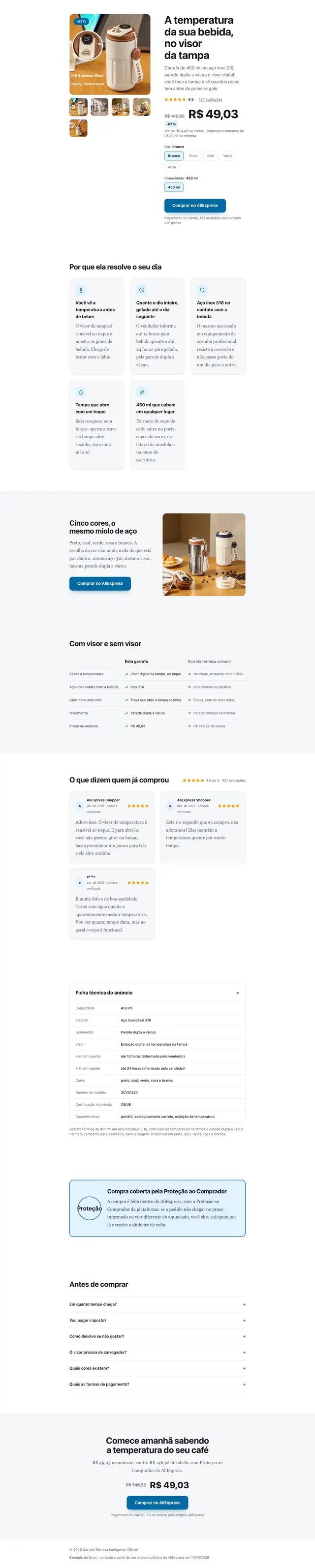
Review / Advertorial
Pro and AgencyAffiliates and content traffic
Article format: someone tested the product and reports back, with a quiet button mid-page and at the end.
- Reads like an article
- First person
- Quiet CTA
Flash Offer
Pro and AgencyPromotions and stock clearance
Countdown, remaining stock in plain sight and a multi-unit bundle.
- Countdown
- Remaining stock
- 2 + 1 bundle
Every generated page ships with these blocks.
No blank canvas: the structure that sells physical products comes assembled and filled with the data from your link.
- 01Urgency bar with shipping, delivery time and guarantee
- 02Product gallery with price, struck anchor price and discount
- 03Rating, review count and variant picker
- 04Secure payment, guarantee and tracked shipping badges
- 05Benefits written as benefits, not as specifications
- 06Visual demonstration of the product in use
- 07Social proof with the best reviews from the source
- 08Collapsible spec sheet
- 09Comparison against the generic alternative
- 10Guarantee block in zero-risk language
- 11Objection-breaking questions: delivery, returns, payment
- 12Sticky mobile bar with price and buy button always in reach